Showing posts with label client project. Show all posts

Monday, 21 September 2015

Serenity Visual Shop page


Client notes


I've layed out the products in alphabetical order with linked images that go to your Facebook albums.


Tuesday, 6 May 2014

Sonic machines set of icons completed


I finished the final icon for the set of icons for client project: Sonic Machines. This is for the splash page.


And this is what the set looks together:


Tuesday, 18 March 2014

Client Project: Sonic Machines Development


Basic template so far coded :


Resources


Responsive slider: http://owlgraphic.com/owlcarousel/


Sunday, 9 March 2014

Client Project: Portfolio Mockup


Individual music page

On each individual music page he wants the following: text, video and music tracks. The music tracks are finished versions of the piece and are different to the video content. These will be on this page, or on the main page if it becomes operational (the album sidebar)

He doesn't want individual sound file/clips of his work (like on his exhibition).

As extra’s he would like a sliding gallery for pieces that don’t have a video (vinyl work). One with a window and scrollable arrow keys to navigate across each picture.


Icon’s 

He likes the icons. He wants to keep the racing car one the same, and he likes the circle details on both the vinyl and washing machine.

He prefers the simple triangle for the metronome but if possible it would be nice if there was a graphical detail that would represent the pendulum rather than the scales.


Home Page

He has decided he wants all the textual information on the front page. He has sent me the text he wants on there, he may condense it and make it a bit shorter to fit the main page. He doesn't want a separate about me page.

On the front page, the video featured will be a video of his latest work.


Tuesday, 4 March 2014

Client Project: Mockup Icons


I had a client meeting with Owen today from Sonic machines and he looked at the designs I've come up with and he is really happy with them.

He liked the one which had a balance between the constellation and image of the object both being equally prominent. He thinks you need to strike a balance between the two.

He likes both the white line and the black line lines for the constellation pattern. He likes the faded lack on the metronome but the darker shade of purple looks better on the washing machine image. He is happy for me to create 3 more for each icon.


Thursday, 27 February 2014

Client Project: Mockup feedback and development


This email encompasses the feedback and suggested improvements I should make to improve my client website for Sonic machines based on my latest design.

Revised web-mockup design


"Hello Owen,
I have uploaded both versions of the new layout design onto the shared drop box. :)

I got feedback from my Shaun Belcher today. I’m going to summarise what he said here so I do apologise for the long email. 

He really liked the texture and the feel of the website and it looked more interesting than my first design, personally he preferred the blue version. I personally like the blue one too, but it’s your website so it’s your decision. Feel free to let me know anytime when you decide which one you prefer. Some of his suggestions for improvements was to try a different font for the main body text, such as “times new roman”. Or another “Serif font” that might fit into the theme of analogue objects.  I could do this and then show you the result and you can see which one you prefer? 

He also wondered if it would look nice if the constellation decorations on each webpage (portfolio, blog, contact) could vary slightly to give it some subtle variety. 

He also suggested the possibility of creating a “splash page”. A splash page is an visual introductionary webpage to your website, that doesn't provide the actual content, but offers visitors some kind of intuition or background information for what the site is about. It’s designed to intrigue the viewer and lure them into the website. Splash pages are used as an additional form of advertising.

I think Shaun tried to explain to you what it would look like. Basically, you know those constellations that are on the design that I showed you on Tuesday? Those were based on real constellations (that have names). Shaun said what could be really inventive and interesting to do would be make up a constellation graphic for each of your audio pieces as “icons”. For example the metronome music piece would be in a triangle shape constellation, and the washing machine in a square shaped constellation and vice versa. All these icons will be put onto one page against a textural background and right in the middle there will be a big logo “sonic machines” hyperlink that you click on to enter the main website. This page is separate from the main home page. Hope you aren’t confused?

I guess it could be hard to imagine without seeing it visually so I’l throw up a mock up visual to show you what I mean and you could tell me if you like it or not, is that okay with you?

Please let me know when you decide how much background textual information you want on your website? I suggested that if you wish I could create a separate “about me” page that would elaborate further from the initial basic description of yourself on the main home page but it's what ever suits you. :)

Thanks
Wilson Chiu"

Inspiration Sources


constellation patterns
washing machine technical drawing

Tuesday, 25 February 2014

Client Project: Layout mockup development


I've just had  a client meeting with Owen Baxter to show him my new mock-up designs.
My idea has been influenced by Origami Biro with their use of texture. My client liked the background with the interesting brush strokes and the interesting bits of rust scattered around. He could see the triangles represent his object oriented approach and the metronome.

Overall he was happy with the design and he thought it represented him and his work well.
I came up with two colour variations, one with a grainy brown texture and the other a sleek painted blue texture. He likes both and is going to consider which one he likes.

We compared this design to my first minimalist layout. I've tried to retain some of the simplicity from my previous design while livening it up with more interesting earthy tones.


In regards to the text he wants on the main page he’s unsure how much to put on because a scrollbar may breakup the design. I suggested that if he wished I could create a separate “about me” page that would elaborate further from the initial basic description of himself on the home page.

Monday, 24 February 2014

Client Project: Further initial ideas


Texture, abstract geometrical shapes/patterns


I'm looking at alternative ideas to the modern layout I've come up with for Owen Baxter, Sonic Machines. My lecturer said it looks too simplistic.

A good source of inspiration was Origami Biro, their use of textures create a good atmospheric look and appeal. An idea would be to incorporate some sort of textural quality to the logo to make it more interesting but keeping it looking exactly the way it is. At the moment the colour is just plain black.If there was an installation for Biro, there would be different materials you could feel and touch. Biro’s image are very earthy and natural looking.

Some other great examples of texture and pattern are: Sourced from: [image]


Also this artists Gemma Anderson use of texture is very interesting:


Antique, victorian and steampunk instruments are very nice and fits into the theme:
Sourced from: [image][image][image]


I think abstract geometric shapes are a good idea, like star constellations. The texture and feel of them look very interesting, especially when put on a grainy brown paper surface texture or a painted texture. Notably, the font on the last image looks very victorian, analogue like!
Sourced from: [image][image][image]


 Geometric shapes might work for the navigation, this reminds me of Pink Floyd's work with the Triangles on their album cover. The Triangle kind of represents the metronome that Owen used for one of his pieces.


Client Project: Logo Development


The latest design:


Owen liked the lower case version of the logo but he wanted all the letters to be lower case to make it look equal height. (balanced composition) He thinks it looks modern. He likes how I’ve kept the parts of the logo that he did like and not overcomplicating the logo by having too many symbols. (e.g. the starting “S” letter is not a symbol)

He looked at the upper case but he didn't like it as much.

He looked at the S.M. Initials design but he didn't like it because the s becomes a bit difficult to distinguish. When it is at the end of the logo it becomes more obvious what it is.


Sunday, 2 February 2014

Client Project: Initial designs & ideas


Minimalism

Owen really likes the minimalism idea because there is a focus on the webpage. It feels a lot less cluttered.
He prefers this over the black design because it looks more sparse and modern.
The dark color scheme one probably doesn't work as well because the white on black is harder to read. And you need good strong bright images for this sort of thing. (inspiration from the exhibition interface)
An example of minimalism that he likes is how the software “FXpansion” has changed (the program that he creates his music on.) The interface has gone for a cleaner and more simple user interface look. It’s a lot less cluttered but there is still a way to expand the toolkit for more advanced features. Whereas, with the old interface it was always really large and cluttered looking.


Textured 

He thinks the Biro textured idea is nice. If there was an installation for Biro, there would be different materials you could feel and touch. Biro’s image are very earthy and natural looking. A possible idea could be to put texture onto each different track’s portfolio. So for example, the washing machine is more industrial/ metallic, and the metronome is more harmonising. However, he wants a unifying style still so he doesn’t want it too busy or different from each other. (A collective)
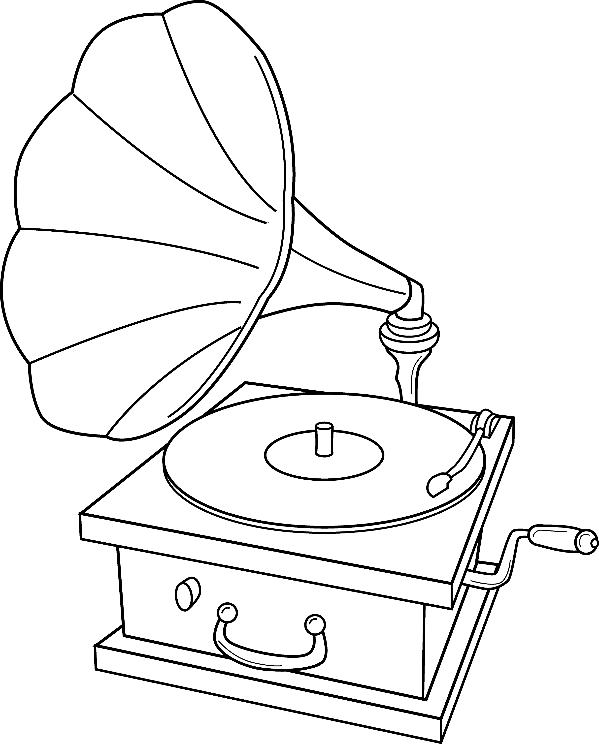


Steampunk

Owen is interested in mechanical objects, so clogs, wheels, kinetic objects etc.
The steakpunk clock is interesting because Owen uses real physical objects to generate sound.
Whereas, with the steampunk guitar it suggests deconstruction and melding pipes on the guitar. Sonic sounds is more about being natural and not taking it apart. 


Logo Design

He really likes the logo! He wants to change it to sonic machines instead of sounds. And to try and experiment with lower case to see what it will look like. He likes the more steampunk like one because It puts the gears in context, otherwise it becomes ambiguous what it is supposed to be. (font used: "Time to get a watch"


Layout

With the homepage layout he is happy with what I put on there because the tracks are what people want to get to first and a short background, description about him and his work.
The portfolio page consists of 4 projects, and each one will have content like music, sounds, video, pictures on it. Perhaps a slider could be good approach? This is better than having separate links for each (music, sounds, video) because then the navigation would be too deep. People don’t want to go through multiple menu’s. 


Monday, 27 January 2014

Client Project: Brief for Sonic Machines


This is the full brief for the client project I am doing.

  • A portfolio website that features a selection of his best work for self-promotion. 4-5 pages.
  • An online blog where he can keep an archive of all his work, content, bits and pieces and post new updates/information, e.g. current projects, performances. 
  • Have all his external networking sites (Facebook, LinkedIn, blog) to be connected to his website (badges)
  • Use his Facebook profile for advertising performances or events
  • He’s keen to make the website responsive for tablet and mobile use to 
  • get ahead with the latest web trends.
  • Sonic machines is about a collection of different objects. He wants a set of icons that reflect a “package” (with coherent unifying style, like 
  • adobe software icons)
  • He’s keen for me to rebrand his logo, he doesn’t have an official one but usually uses the company name in lower case, black
  • He would like me to make recommendations on the latest blogging and social networking tools/technologies
  • He would like me to recommend him on a web hosting company
  • This is under discussion but a way for him to share his resources with other people. To allow users to download his “refill” format sound files for personal use.

Quality Criteria

  • His design should reflect “doing a lot with a little”. His approach to music is to create music in an “explosive way”. He’s interested in what you can do with an instrument and getting the most you can get under defined rules. He will try to get every possible sound he could possibly get from a certain object. It’s about taking something simple and seeing what you can do with it.
  • His website is self-promotion and allowing potential collaboration or job offers from other musicians.
  • If possible, make the website somewhat easy to update for someone with no css/html knowledge.
  • His target audience are people who are interested in experimental music.
  • His website should reflect in some way how he makes music. He would record for example, the different sounds a washing machine makes under intended use. And then extract the sound, manipulate the sound to create music. It’s about taking something simple and seeing what you can do with it.


Friday, 24 January 2014

Negotiated Client Project: Owen Baxter, Sonic Sounds


https://myspace.com/sonicmachines / / http://sonicmachines.blogspot.co.uk/

My new project is working with Owen Baxter aka "Sonic Sounds", an experimental musician. I think this will be good because it is something a bit different and I have room for visual experimentation. I've met Owen to find more about his work, I think I have a good understanding of Owen's style and work processes. In summary these are:

Define your project


Portfolio
  • 5 page website showing his best work
  • Responsive
  • Integrate his social media (badges); social platform
Personal online blog
  • A separate blog to upload his latest work, projects etc

Purpose of the Project


Self Promotion 
  • His website is self-promotion; to put himself out there. Seeking potential collaboration or job offers from other musicians.

Target Audience
  • People who are interested in  “Experimental” music. (underground genre)

Branding and Identity
  • Rebrand his logo, he doesn’t have an official one but usually uses the company name in lower case, black
  • Sonic machines is about a collection of different objects. Each object needs a icon. He wants a set of icons that reflect a “package” (different icons but with unifying style, like adobe software icons)
Most important thing to say
  • “It’s about taking something simple and seeing what you can do with it”
  • “create music in an explosive way ” 
  • “Limited Palette.”


Sunday, 8 December 2013

Client Project YCA: Feedback 3


I received some more feedback from my lecturer and my peers for my project. These comments were mainly aimed at my introduction splash page:

  • The 2 buttons on the front aren't positioned very well. Perhaps be better to try a different layout to make it easier for the user to use.
  • The main title on the splash page is hard to read! The font doesn't stand out and disappears ino the background
  • The user may or may not understand the terminology to "start desktop" from "start tablet". 


Finalised simplified splash page navigation


Tuesday, 3 December 2013

Client Project YCA: Development5/Feedback


Slider Customisation 

I've added a linear gradient CSS3 to my slidebar divider to make it easier to use. It now corresponds to the colors of the tagclouds. I think this works well. 

However, I need a bit of code to remove the bit of default browser padding.

1st Idea

I've tried various re-positioning of the textvalue before I came up with my final design.

2nd Idea


I managed to move the slider to a fixed footer position by googling: fixed footerposition fixed solution. I think this makes the most sense. 

Finalised Idea

Client Project YCA: Splash development


Dreamweaver Development

From my initial Photohop design I've been implementing my website on Dreamweaver. I've decided to go with the last design. I've also found that a button as well as the hyperlink is useful user interface-wise because it becomes more obvious:


In my latest version, I have replaced the image based title to a text based one. It was much simplier to align it in the middle with "text-align: center" as opposed to paddng the image. Also the text would be great for SEO, searching for those words.


Client Project YCA: Splash page


Photoshop Mockup designs

I want to make it vibrant and look aesthetic. The different colors is a continuation of the theme in my main artefact. This helps to establish a consistency throughout the design. The colors are a "key" to the different time periods. The concept for the splash page is

  • Splash page is: EXTERIOR 
  • Main artefact interactive timeline: INTERIOR  

I'm going for contrast and positive and negative space in my splash page.

Photoshop mock-up 1

I like this design far better, the black is a good contrast to the background while being able to see through to the picture of Nottingham Theatre. Notably, the instructions/enter links; I got this idea when I thought about interface design on Flash games. e.g. Neopets. It just makes sense.

Photoshop mock-up 3

A variation of the previous design, I do believe this one works well. 

Photoshop mockup 4


Friday, 29 November 2013

Client Project YCA: Development 4


Background ideas:

Spirit Nottingham
Interior1
Interior2


Next Steps

  • Try making it responsive by giving the content wrapper a % size, compliment this with media queries. Perhaps at widescreen give a fixed width, and at lower screen sizes give a responsive width
  • Try giving the image in lightbox a max or min width
  • Media query the text in the lightbox to give responsive font sizes
  • Make a menu screen
  • Customise the sidebar or add stylation to the current date/slider divider
  • Add a 4th line of productions 
  • HEX color code transparency converter


Thursday, 28 November 2013

Client Project YCA: Development 3


This is the latest version of my Nottingham Loves Theatre Royal:

Work in progress

My lecturer Shaun Belcher inspired me to use the theme of the "KEEP CALM and..." I am very happy with it so far. The vector crown logo is from: Crown Vector.


Client Project YCA: Feedback 2


  • Try to create a feel for the theatre within the design
  • Perhaps frame the content into the interior theatre screen (as a background) to create the look and feel of one. Or use Pillars, photo of theatre royal
  • Incorporate a "KEEP CALM AND EAT CUPCAKES" crown logo (theatre themed crown) onto each coloured tag cloud box. Funky, could look nice. (max width or min width for responsive)
  • Reduce the padding on the boxes
  • The scale between the boxes (when sliding) isn't obvious enough apparently
  • Raj Deep said there is enough content already, too many boxes may overclutter it (simple looks good). Also the user will NOT want to scroll down!
  • Ribbon the image, or frame a color key on the image itself for color key? (an idea) 

Wednesday, 27 November 2013

Client Project YCA: Development 3


Version 1

Color coded Horizontal layout

Version 2

Descending List like a Theatre playbill

Version 3

Multiple column layout, like mosaic/windows8 

Version 4

Like version 1 but FLEXIBLE auto height dividers

Version 5

Like version 4 but with padding: like js plugins for images

JQUERY MOSAIC PLUGIN: Link